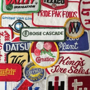
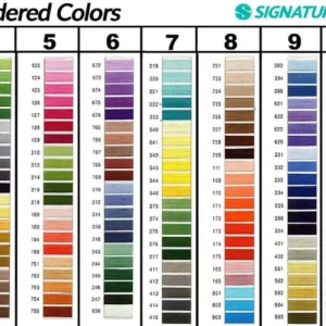
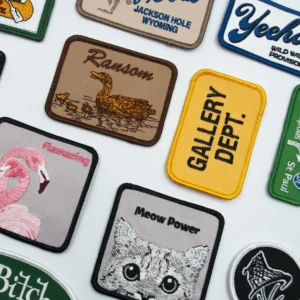
Color theory for embroidered patches guides designers beyond pretty hues to craft a cohesive color story that complements the design, the fabric it sits on, and the patch’s purpose, ensuring the final piece communicates the brand message or character clearly whether viewed from across a room or scrutinized up close, and that it remains versatile across different garment colors, while also offering practical tips for avoiding common color mistakes and ensuring print and embroidery alignment across substrates. This practical framework helps balance hue, value, and saturation by mapping how colors interact on textiles, considering ambient lighting, textile texture, dye lot variations, and potential garment colors so the patch remains legible, eye-catching, and harmonious in catalogs, photos, and live wear.